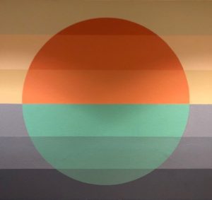
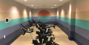
Epoch first partnered with McKenzie and Elliott Smith in 2013 on a community garden project in Lake Nona. Since then, this talented couple of artists have shared their creations in 5 more of our communities. Hand-painted murals spanning up to 600 ft. long are just one example of the type of detail Epoch employs into every community they create. We asked McKenzie to share with us the ‘typical’ process, average timeline and some highlights and challenges; here is what she had to say:
…
Creative Process.
Each mural is a little different, but there are definitely some constants as well.
Our main focus is to let the visual experience guide the artistic concept, not the other way around. This frees us up to be as simple, bold, or vibrant as we need to be, so that the mural feels natural, interesting, and inviting. It is so easy to create a concept that is forced, because you think you need to be impressive or something. The key is to get ego out of it and let the work guide you.
This makes each mural process unique in many ways. But regardless, we always start with a lot of discussion with architects and designers involved with the property. This gives us a sense of the overall vision. We then go through a phase of concept development that may take weeks. It involves creating mood boards, color palettes, and general aesthetic/stylistic approaches. For example, do we want this to feel organic? Crisp and geometric? What do we want it to add or enhance about the property? Does it need to feel subtle? Energetic? Soothing? This stage can get very abstract and sometimes surprising – we have found that the best ideas come from trusting the process and letting ideas reveal themselves, versus trying to plow a straight line. It’s exploratory and takes a lot of patience. Sometimes we end up where we started with a first sketch. Sometimes the idea will be very different than where we started, and not reveal itself until later in development.
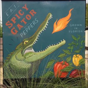
Colors are always very interesting and often challenging.
Sometimes they work right out of the paint can. But often we have to hand mix to adjust. Colors can change so much depending on the time of day and lighting, so we have to choose the best balance. We spend a lot of time just dialing colors in, choosing between several shades of the same color.
Style is another big consideration.
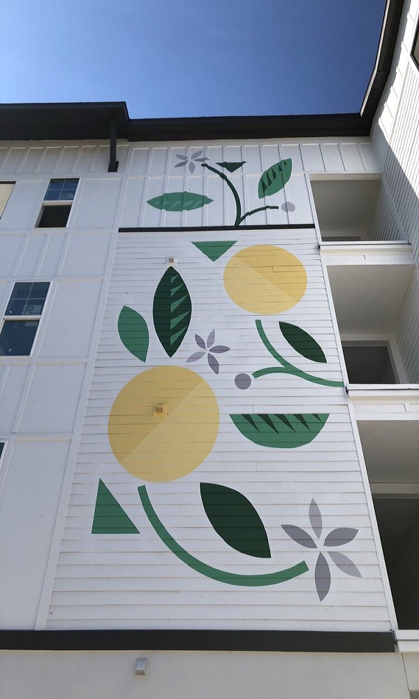
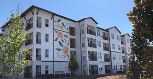
We often end up in a retro-modern abstract genre. But within that genre, there are so many variables. At Sonceto, we decided to use a lot of negative space, due to the clean crisp white facades. This allowed the bolder colors to pop without feeling overpowering, and also allowed us to play more with a more organic flow of the shapes.
Kestra is also abstract and modern, but is surrounded by angles and architecture – so it needed to be more clean, organized, and geometric.
On the other hand, Pierpont – which was also a retro-modern style – winds around the building for 600 feet, and will be either viewed from windows or from people walking along the length of the wall, so it is supposed to tell more of a story and incorporates more identifiable imagery.
To contrast, the garden murals at Lake Nona were a totally different style – a throwback to vintage illustration, because the scale was smaller and the panels created a collection of images.
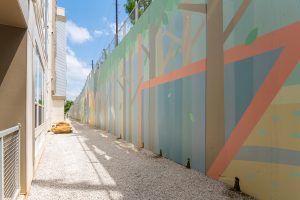
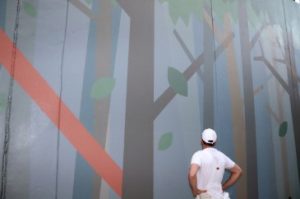
We also think a lot about POV (point of view).
Again, context is everything for these murals. It matters what’s around them and the distance/angle from which they’ll be seen. At Kestra, because it’s so close to the entrance and foot traffic, we all decided that it should feel very subtle, almost like an architectural accent. It’s meant to simply break up the divider wall and add dimension.
At Sonceto, the murals will mostly be viewed from farther away – so there was more room for something bold and vibrant.
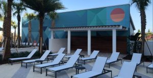
At Veere, the wall is like a backdrop to the entire pool scene – so we wanted it to feel more immersive and atmospheric.
Installation.
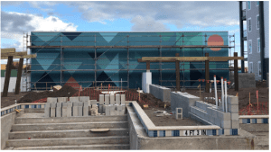
Installation depends on the size of the mural, how difficult it is to maneuver/access, and the complexity of the design – but the typical installation takes about one week. When everything is flowing and there are no unexpected obstacles, the work can flow very quickly, because we put a good deal of time into planning the basic logistics of the mural: How to scale the drawn design onto the wall, which colors to lay first, etc. Basically, an order of operations. It all depends on the wall – if it has natural lines in the facade like brick or paneling, we use that as a grid to scale the design. But if its flat like stucco, we have to get more mathematical and resourceful to maintain clean lines and geometry at large scale.
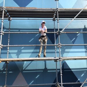
But no matter how good the plan, there are always unexpected obstacles when you’re trying to create artwork 40’ high on the outside of a building. For us, that’s part of the challenge that we enjoy. It takes a lot of problem solving skills, and you have to be ok with making art while getting sweaty, dirty, and working outdoors in all kinds of conditions. There are so many things we would never have thought about dealing with when we started these murals, from weather changes, to morning dew, bugs (love bug season can be a real issue with wet paint!), timing of sunlight, etc. In Pierpont, for example, we experienced every kind of weather as we painted – sweltering heat, snow, wind, rain (often moving from one to the other rapidly). All of these things affect the flow of the work. It takes a lot of coordination, planning, and flexibility to find a good working rhythm.
…
Overall, creating these murals is one of the most fulfilling types of artistic work either of us have ever done. It’s so satisfying to watch an idea go from paper to 800 square feet, having overcome difficult design and logistical challenges. But I think our favorite part about it is that we’re creating artwork that isn’t just about us – they are created with other people in mind. These murals are meant to be experienced, enjoyed, and interacted with – lived with. That creates a connection between us and all of the residents, which takes our art from more introverted work to something tangible and relational. That’s a rare experience for artists and we don’t take it for granted.
We look forward to continuing our partnership to create. To see more work by McKenzie and Elliott, visit their website at www.themeslands.com.
