Epoch communities stand out from the crowd not only because of their unique design, beautiful finishes and competitive amenities, but also for their attention to detail from the initial decision of site selection down to every last piece of furniture and decor selected. An integral part of the equation that sets the tone for the entire community is the naming process and the elements that stem from a name. There is nothing standard about our practice of naming and creating a brand story for each community we develop. You can see how this plays out in 2 of our newest communities and sister sites, once dubbed Flora Ridge due to their location in Kissimmee, FL.
Working with a local marketing and branding agency, PUSH, the Epoch team was presented with 12 names for each community and something rare happened; we had unanimously agreed on the very first name presented as our first choice for the Active Adult community.
The name that struck us all and gave Flora Ridge Phase 2 an identity is Calirosa. The name Calirosa was inspired by the word “Calaroso” which is Italian for warm, hearty, cordial. Cali is also a Greek root which means beautiful or lovely. Rosa is Spanish & Italian for rose or flower. All of these elements perfectly captured the lifestyle we are building at this community specifically for the active adult age group. Inspired by the names linguistic origin this brand expression revolves around a distinct geometric icon that is both a sun and a flower and is symbolic for how life at Calirosa will truly be in full bloom for the active adults who call it home. The brands primary colors, a rich red, muted black and smooth cream, are inspired by nature and the calm, welcoming environment of Calirosa.




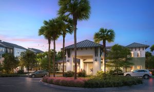
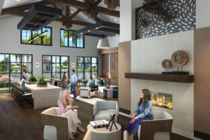
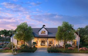
When it came to naming the conventional community, it took a few tries to find the right fit. After much deliberation we landed on Sonceto. Sonceto is the Macedonian word for sun. It has an appealing sound, is easy to pronounce and the word has a Mediterranean feel to it. Sonceto is a community that offers everything under the sun. All in one place. The logomark is inspired by rustic, modern farmhouse architecture and the cypress wetlands of Kissimmee, and represents the juxtaposition the community has with its natural surroundings. The sun above the trees is a nod the Macedonian origin of sonceto. The primary brand colors, including a lively orange, natural wood and definitive black are inspired by the natural, yet vibrant environment of Sonceto.
